


pROJECT OVERVIEW
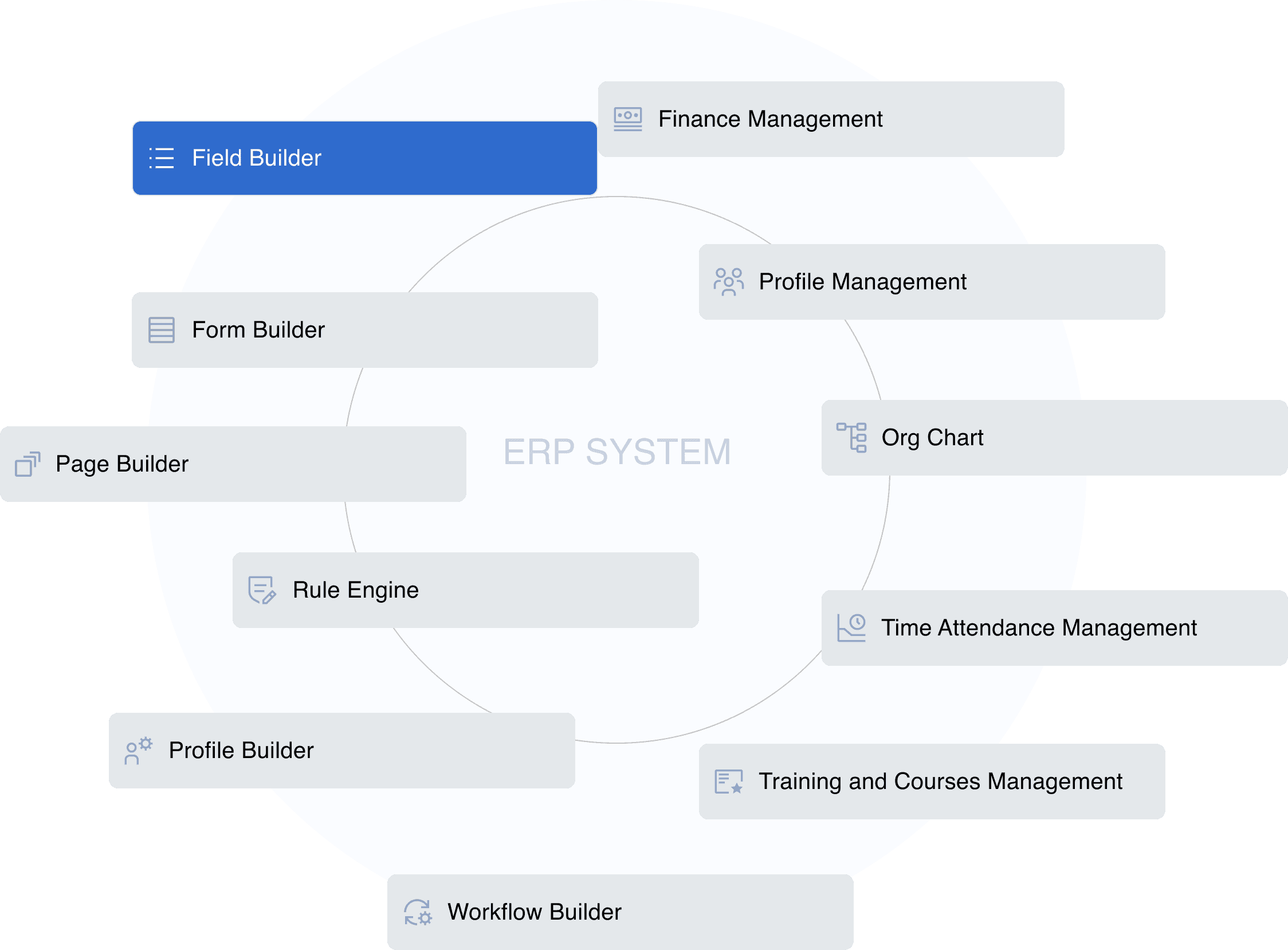
The ERP is an adaptable and scalable system that can help the client to create and modify anything as needed starting from input fields and forms finishing by organization structure.
The Enterprise Resource Planning (ERP) system that we want to design will be used in an existing organization. It will be accessed by over three thousand employees at the start. The client organization has a well-established set of processes and workflows that are critical to their business operations. Almost every workflow starts with submitting a different form, with the subsequent need of different position holders to review and process the request.
The nature of requests varies from a simple day-off or salary review, continued with much more complex requests for business trips to different countries, training requests, etc. Due to the specific nature of their business, The workflows, process, the people responsible for them constantly changes which can have a significant impact on the organization.This highlights the urgent need for an adaptable and scalable ERP system that can help them create and modify anything as needed starting from input fields and forms finishing by organization structure.
PRODUCT REQUIREMENTS DOCUMENT (PRD) REVIEW


USER RESEARCH
The fundamental idea behind this analysis is that cognitive biases are the roots of how people perceive information and interact with the product.
Understanding and addressing those biases in design can dramatically improve the product's usability and overall user experience. A major part of the result of the analysis can be found below:

Link to full image
Link to the tool used to build Persona

MAIN CHALLENGES
While there are multiple off-the-shelf solutions presented on the market, the main challenge that our customers faced was the limited flexibility of existing solutions.
The customer wanted to have a highly-flexible system with a modular structure that would enhance each module separately from the rest.
Another major challenge was to find a way to provide simple navigation in the system so it won’t be overwhelming for users despite the extreme amount of complex, nuanced functionality and features.

INFORMATION ARCHITECTURE
As the first step of addressing the above-mentioned challenges, we’ve decided to visualize the Information Architecture (IA) of the project. This allowed us to have a birds-eye view/big picture of the software and its main navigation mechanics.

uSER FLOW
For the sake of this case study we focus on Field Builder. Here you can see the IA of “New Field Creation” workflow that is being triggered from Field Builder page.

WIREFRAME dESIGN
The next step was to design wireframes. Based on our knowledge of the software used by our customers we focus on building similar user experiences. With this approach we stick to Jakob’s law: the tendency for users to develop an expectation of design conventions based on their cumulative experience from other websites.

Field Builder
To name a few:
What's the primary purpose of the data table for the user? How should its data be used?
What devices will be used to view the table?
What are the available interactions for the user?
What are the customization options that we should provide?
All this should be clearly described in the PRD, as it's a matter of product manager's research.
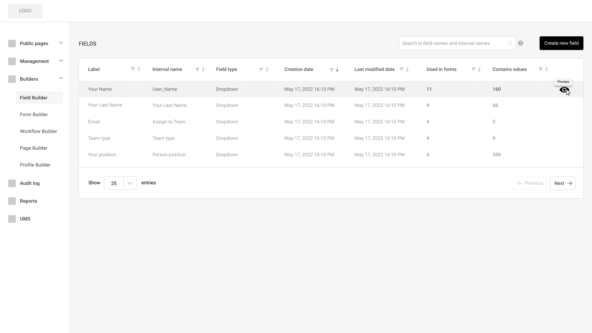
After reading the PRD, we see that the Field Builder page is basically the place that contains all the existing fields in the system. In addition, it shows metadata per field tailored to the product users' business interests.
The wireframe we come up with looks like this:
New field creation workflow
Field Builder consists of a page, where a list of existing fields is displayed, and the actual workspace, where the fields are created. It was decided to visually represent the existing fields in the mainframe as a data table.
Using tables is the best way to arrange hard-to-understand information in enterprise software design.
A well-thought and designed interaction on the table can greatly improve clarity, simplify the user experience, and optimize data utilization. However, some crucial factors should be considered when designing a table.
To name a few:
What's the primary purpose of the data table for the user? How should its data be used?
What devices will be used to view the table?
What are the available interactions for the user?
What are the customization options that we should provide?
All this should be clearly described in the PRD, as it's a matter of product manager's research.
After reading the PRD, we see that the Field Builder page is basically the place that contains all the existing fields in the system. In addition, it shows metadata per field tailored to the product users' business interests.
The wireframe we come up with looks like this:


uI DESIGN AND PROTOTYPE
Now we have wireframes and low-fidelity prototypes ready. What we want to achieve next is the finalization of the UI design and prototype.
While considering various color palettes, we were choosing from the most neutral ones. This was because users will be using the product for extended periods, and we wanted to avoid a situation where our interface is an eyesore to the user.
We’ve opted for muted, clean, simple colors and visuals to ensure a comfortable, easy-on-the-eyes experience. The corners of the visual elements are slightly rounded to make the interface look friendly. The font is Proxima Nova, a well-designed and versatile font that balances readability, aesthetics, and accessibility.


DESIGN ITERATIONS
The idea of the pause was to "zoom out" from so many details that we worked at and identify other details that needed to be adjusted. These are the things that we've come up at this stage:
Data table refinements
CONTENT ALIGNMENT
Whether textual or numerical data, the way it is represented in the table differs. The numerical data in our data table was left-aligned, which was not helping with readability, so we re-aligned it right.
The data and multiple pieces of research show that when numeric values are right-aligned, it is much easier to compare them. This comes with exceptions. For instance, those can be left aligned when talking about qualitative numbers such as date, phone, and postal code.
DUPLICATING IN NAME
We have spotted and removed duplicated words in some of the columns to alleviate the overall noise on the table.
FIELD BUILDER REFINEMENT
After one of the late rounds of solution validation with customers, we've been faced with a need to implement the idea of fields hierarchy and field group that initially didn't exist. To integrate these new concepts, we restructured the workspace. It has become obvious that we must abandon our idea of having a "modal window" and add a page step in the workflow.
We have used an exciting concept that I read in the book “About Face: The Essentials of Interaction Design” by Alan Cooper about different postures of digital products:
“Programs that monopolize users’ attention for long periods of time are sovereign posture applications. Sovereign applications offer a large set of related functions and features, and users tend to keep them up and “running continuously, occupying the full screen.”
Since we already know that our product users will regularly interact with the system and stay in it for a long time, the Field Builder feature fits into the “sovereign posture” concept, so we shouldn’t limit the space the system consumes.
So we've updated the design based on Field Builder's overall stance reconsideration and new product requirements: "ability to create field groups and set relationship between them".

USER TESTING & fINAL RESULT
As a final step in the design process, user testing was conducted to validate the experience and usability of the whole field creation and editing workflows.
Although we have constantly been working with customers to validate major milestones, we've now prepared a fully-functional prototype consisting of more than X screens in Figma.
During the demo, it has become evident that the parent-child relationship between fields is not obvious. We lacked a visual clue to clarify which fields were subordinate and which were superior. As a solution, a small indicator has been added to the fields to communicate their status better and not to violate the law of "Visibility of system status". This change helped users quickly understand a field's current state, and that was pretty much the last piece of feedback we processed.

Thanks for watching
Back to homepage